Jhpiego is a non-profit organization that works to improve the health and well-being of women and their families in over 40 countries worldwide. The organization sought to redesign its website to communicate its mission better and engage individual donors while making its technical resources more accessible to the public.
Tools Used


My Role
As the design lead, my role was to oversee the website redesign process, collaborate with the project team and stakeholders, and ensure that the new website met Jhpiego’s goals and strategic imperatives.
The Team
The project team comprised a project manager, two other web designers/front-end developers, four content writers, user research consultants, communications leadership, and advisory board members.
The Ask
Jhpiego wanted a website that effectively communicated its mission and impact, engaged individual donors, and made its technical resources more accessible to the public. The website should be visually engaging and accessible while providing in-depth information for those seeking it.
The Challenge
The previous Jhpiego website was overly technical and did not effectively communicate the organization’s mission to the public. The new website needed to balance providing technical information with engaging and emotionally impactful storytelling.


Our Approach
To meet Jhpiego’s goals, we partnered with an outside consultant to conduct user research to understand the needs and motivations of Jhpiego’s target audiences, including individual donors and Jhpiego-trained healthcare workers. We developed a taxonomy and procedures to tag content on the website so that it could be dynamically delivered to users based on their approach to the information. We emphasized visuals to tell a compelling, coherent, accessible, engaging, and emotionally impactful narrative to potential donors or those who didn’t know Jhpiego.
The Solution
The new Jhpiego website successfully tells the organization’s story through photography and visuals, creates more opportunities for engagement and donations by individual donors, and presents information in a way that is easy to understand for lay people but also in-depth for those more technical people. The website is responsive and optimized for low bandwidth without sacrificing visual impact.
Home Page, Anesta’s Story

Our Impact

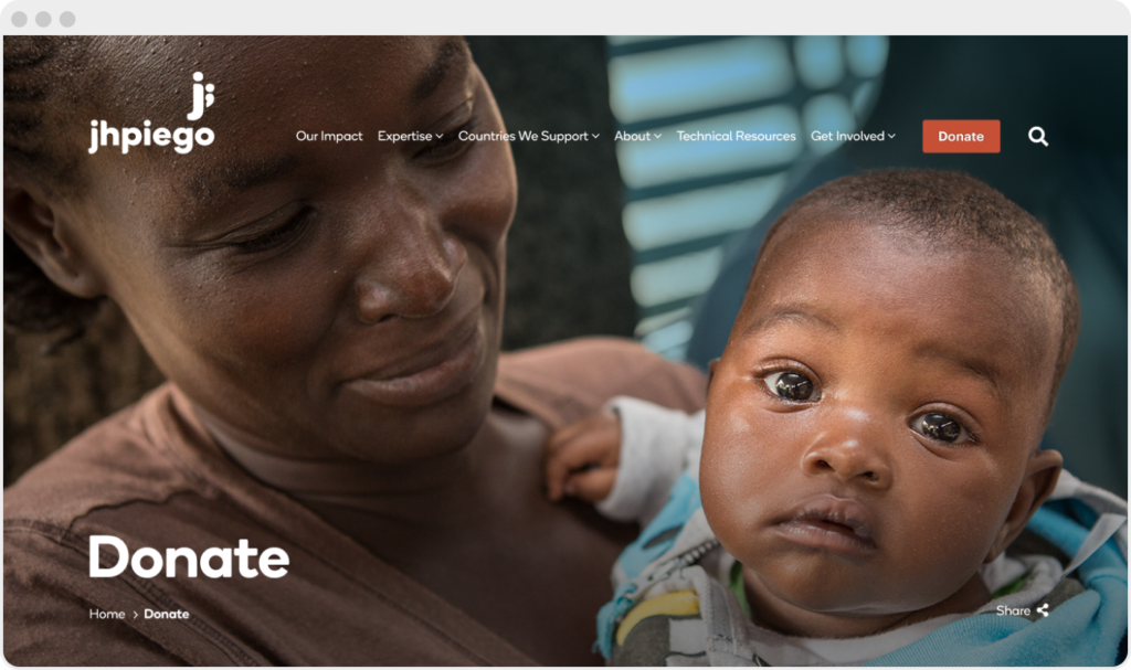
Donate

The Onion

The second example is the “Technical Slide-Out,” which essentially acts as a one-page technical fact sheet for sections where technical folx need more information.
Reflection
We met our goals and successfully created a website that effectively communicates Jhpiego’s mission, engages donors, and makes technical resources accessible to the public. However, I would have outsourced the website development and had more time to focus on original imperatives. I learned how to work with a cross-functional team, where to compromise effectively, and how to find common ground.


