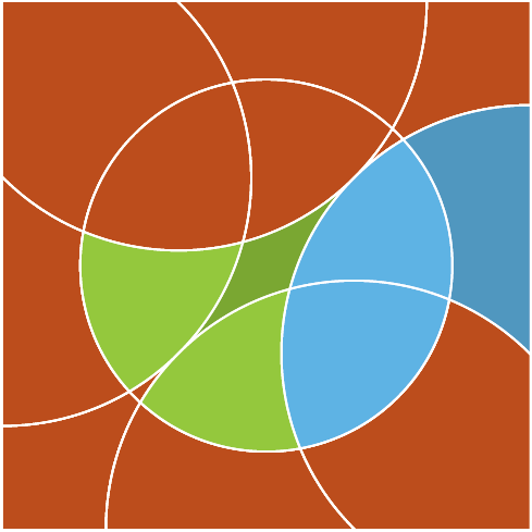
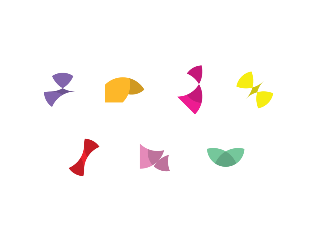
This was a concept piece that was presented to leadership. The Mosaic Learning product logos suite is based on the mosaic grid to the left. Shapes within the same proximity have been pulled out and highlighted for each logo mark. Each shape pattern represents something from nature, and there are many patterns to choose from as our product suite grows.
Tools Used
My Role
I was the sole visual designer, although my role at the time was senior UX designer.
The Team
The project team comprised a product manager and two other visual designers. It was a friendly in-house design competition.
The Ask
As our product line grew at this small eLearning company, the need for product branding was evident. Not only the first two products but many more as our product line scaled.
The Challenge
We had a clear product vision for our two flagship products, Combobulate and Foundry, but the future products had yet to come to fruition. We needed to brand these two existing products while making space for future products.
My Approach
I capitalized on the parent brand, Mosaic Learning, by exploring different patterns and shapes that make up a larger mosaic pattern. I created dozens of different one-color mosaics until I found one with enough shapes to make up branding for our products. I focused on images of plants and animals that embodied and symbolized the core product visions.
The Solution
Combobulate Logo
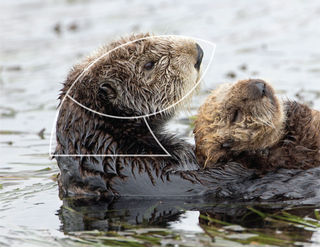
The Combobulate brand mark resembles an otter. Otters are very organized animals that thrive in communities and use tools to solve simple problems.

Foundry Logo
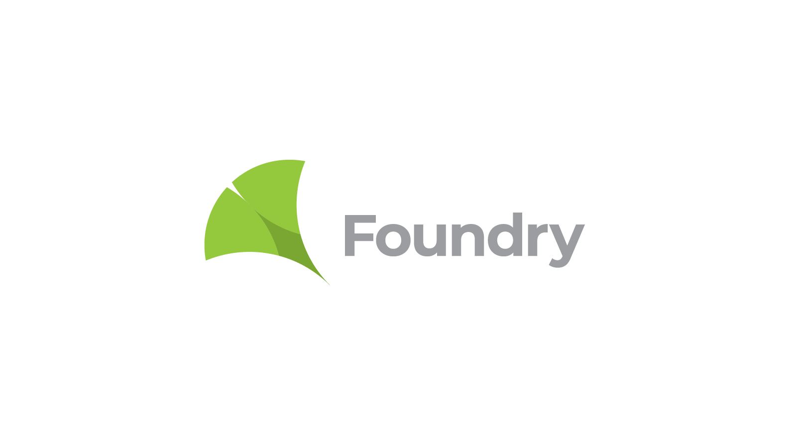
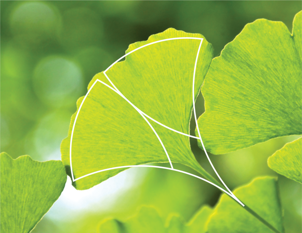
The Foundry brand mark resembles the maidenhair tree leaf or ginkgo. Ginkgo has been shown to improve cognitive function and memory.
Additional Shapes
Reflection
While our leadership team ultimately went in a different direction, I felt that my product logo concepts met the challenge with a solid solution.
